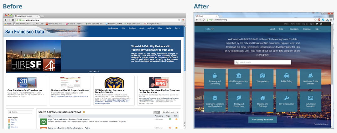
Today we released the new DataSF. You spoke and we listened. Our new design addresses some of the major usability issues on our website:
- Simplifying the category structure (we went from 27 to 10 categories) to improve data discovery
- Making it easy to find data by department (for those familiar with the City)
- Visually integrating the various pages so it felt like you were on the same website
- Simpler, more intuitive and visual help
- Quick tips on accessing the API and getting started
- Adding an about page with links to our strategic plan and reports
Multiple ways to discover data
Based on feedback from both internal and external users - we really wanted to make sure we offered several ways of discovering our data. The following three already existed, but we made some improvements:
- By search. We already offered this, but we made the feature more prominent.
- By category. Our old design made our categories hard to use or even find. They are now featured prominently in the new design.
- By type of dataset. This is a standard Socrata feature, but our new data catalog makes it more intuitive and presents the differences as a conscious choice.
And then we added one more based on hearing again and again how frustrating it was to find data from departments: By department.
A few more details on categories
We spent some time thinking about the categories. And we used a bunch of tools to try and identify the right mix of categories:
- Survey of categories on existing sites. We reviewed categories from major open data websites, both local, national and international. Review the survey here (gdoc).
- Analysis of search terms. Our major finding here was the need to have a category for geographic boundaries.
- Card sorting! This helped us move some of our data around and find new clusters of data.
- User interviews. We asked end users to respond to our categories and tell us what sounded like bureaucratic speak. We tried to remove bureaucratic speak…
While this job will never be done, we think we’ve vastly improved it.
Future Steps
But we still have more to do. Look for future improvements to include:
- Easier distinction between original (or source) dataset and derived views, charts, and maps
- Improved metadata
- Simpler chart creation
And a huge thanks to the development team at Socrata - Lou Huang and Louis Fettet. With a special shout out to Jessica Carsten for shepherding this project.
And we look forward to working with you, the user, to make DataSF a delightful experience!